waterinfo.be Portal Manual
Waterinfo.be is the portal of the Flemish water managers and knowledge institutes. We want to inform you as accurately as possible about floods and droughts via this website. All the measurements and forecasts are to be found here. This way, appropriate measures can be taken to minimise water damage.
waterinfo.be provides current information on four themes:
- Flooding
- Tides
- Rainfall
- Drought
You can click on these themes at the top left of the screen. Historical information can be called up at the top right under "maps and graphs" and "reports". The homepage always shows the most urgent theme first.
Waterinfo.be is composed of various modules (widgets) which you can configure on the screen to suit your own preferences. Each module contains a question mark on which you can click for further information.
Waterinfo reports
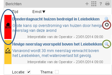
The reports contain current information published by the VMM and Hydrological Information Centre (HIC) operators. The
symbols to the left of the report show the actual theme. The colour of the symbol indicates the severity of the situation. You can sort the reports by theme and by the zoomed-in location on the map. Click on the
magnifying glass to open a more detailed version of the report. For a report related to a specific location, you can use the
black visor icon to zoom into this location on the map of Flanders.
Maps
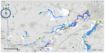 The central element is the map of Flanders, which you can zoom in and out of. On the overview map, a box or flag indicates your current location on the map of Flanders. You can move the box or flag to display another location.
The black visor icon on the map can be used to activate "My location". The map then automatically zooms into your current location. The further you zoom in, the more information you see on the map. To go back to the overview map of Flanders, click on the globe.
The map layers module allows you to tick the information layers you want to view on the map. By clicking on the name of the layer, you can make it visible or transparent. The layers available depend on the theme clicked and are explained in the module's Help function. The explanation of the symbols and colour codes of the various information layers ticked is given in the legend module.
Graphs
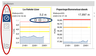 Clicking on the points indicated on the map will open the corresponding graphs in the graphs module. When you hover the mouse over a graph, four icons appear. These icons (from left to right) allow you to centre the location of the measuring point in the map, maximise the graph, add the graph to your favourites, or delete the graph from the module.
You can use the icons left in the module, to indicate the graphs you want to view. You can select your favourite graphs via the star. The clock calls up recently clicked graphs. The icon below it lets you view all graphs for the zoomed-in locations (if you are zoomed in far enough). The bottom icon lets you compare different measurements. You may choose to compare your favourites, recently clicked measuring points, or zoomed-in measuring points. Tick the graphs you want to view and then click on "refresh".
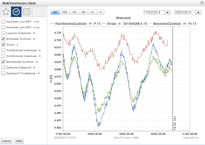
You can maximise the graphs via the rectangle or simply by clicking on the graph. In the maximised window, you can, depending on availability, choose from:
- Measurements (represented by a solid line)
- Short-term forecasts (represented by a dotted line, with uncertainty bands for some stations)
- Long-term forecasts (represented by a dotted line, with uncertainty bands)
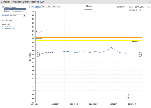
It is also possible to show the other parameters that are measured at the location in the graph. At the top, you can choose the period for which measurements are to be shown. At the top right, you can change the date or the time window, using the arrows that appear when you move the mouse over the graph.
At the top right of the graph are a number of icons that can be used, among other, to bring up a table, download data or create overlaid plots. Overlaid plots allow data to be displayed on top of each other for various months or years. For this, you must select a period made up a number of months or years.
Under Station Info you can find extra information about the location of the measurement point, such as coordinates and possibly a photograph.
Under More info you can find various characteristics that are based on the measurements at that location, e.g. percentile values, extreme values and possible indicators:
- Historical extremes shows a table with the historically most important storms at the location. It includes the date, the peak discharge value and the empirical return period of the storm.
- Extreme values contains a table and a figure showing the evolution of the theoretical peak discharges at different return periods. Here you see how the estimate of the theoretical discharge values for a given return period changes due to changes in the discharge regime of the measurement location (i.a. the installation of retention basins, re-meandering, changing a paved surface, climate change, …).
- Percentile (parameter) shows a figure with corresponding table of the distribution of these parameter values. The percentile figure expresses the percentage of time during which a given value is not met. E.g. 25%: the flow/water level remains below this value for a quarter of the time. These figures are available both for each measurement year and for the entire measurement period.
- LT statistics (N) shows a table with the rainfall totals of the past months and years for this pluviometer.
- Historical extremes (N) contains a figure with the monthly summary statistics for the rainfall recorded by this station.
Colour codes
 The colours green, yellow, orange and red are used in reports, graphs and symbols to indicate the severity of a situation. As described in the key, these colours stand for normal, pre-alert, alert and alarm respectively. The exact description of the alarm thresholds depends on the theme and the location concerned. A flood alarm is always defined differently from a drought alarm.
The following definition applies for high water levels:
| Status |
Colour |
Description |
| Normal |
Green |
No flooding |
| Pre-alert |
Yellow |
Heightened vigilance, no flooding |
| Alert |
Orange |
Particularly heightened vigilance, non-critical flooding possible |
| Alarm |
Red |
Maximum vigilance, critical flooding possible |
Tables
Under the different themes, you can find tables with a summary of current or forecasted data for the relevant theme. You can always bring up more detailed information or a graph by clicking on a table.
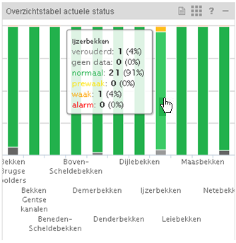 Under the themes "Flooding" and "Tides" you can find tables with a summary of the measured and predicted status. Bars are used to show, for each river basin in Flanders, how many stations have a certain status. Clicking on a bar in the table will open a new table with all stations for the basin and status clicked. Clicking on the various stations will open the corresponding graph in the graphs module.
Under "Rainfall" you can find tables with measured and predicted rainfall. Clicking on a row in the table will open the corresponding graph. The same principle applies for the rainfall deficit table, which can be found under "droughts/current situation".
Twitter
The twitter module shows relevant tweets for the selected theme.
Aids
 The search window at the top of the page allows you to search the entire site. Not only can you search for keywords, but you can also enter an address and locate it on the map.
Under "Flooding" you can find:
- Current situation
- Short-term forecasts
- Long-term forecasts
The information shown on the map varies according to the sub-theme.
The current situation shows the water level and flow measurements. The current themes show only measurements and not the results of the forecasting models.
For measurement points for which thresholds have been defined, the symbols on the map change colour if specified alert or alarm thresholds have been exceeded.
Forecasts are made on the basis of computer models. These simulate the physical properties of a waterway and compute how the water will flow through the bed. Precipitation forecasts are used as basis for these calculations.
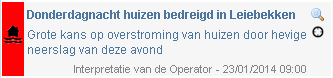 The (HIC) officers on-duty and (VMM) operators interpret the results of these models in order to filter out the most relevant information. This interpretation can be found in the waterinfo reports.
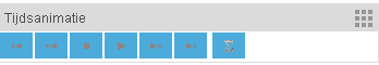 The short-term forecasts have a time horizon of 48 hours. The time animation module allows the forecasted flooding contours (i.e. the blue areas on the map) and freeboards (i.e. the coloured dikes of navigable waterways) for different points in time to be displayed on the map. This does require a sufficient level of zoom. In the "forecasted situation" themes, measurement and forecasting points change colour as a function of the forecasts (green - yellow - orange - red as the severity of the situation increases).
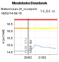 The graphs below the map show the forecasts in the form of a dotted line. A vertical line is used to indicate the start time of the forecast (STF). A second vertical line shows the current time (NOW).
If you maximise the graph, a band of forecasts will appear next to the dotted line. This band indicates the probability of the forecast on the basis of various rainfall forecasts. The change in colour of the dykes of navigable waterways, based on the forecast, i.e. the freeboard, is also shown on the map.
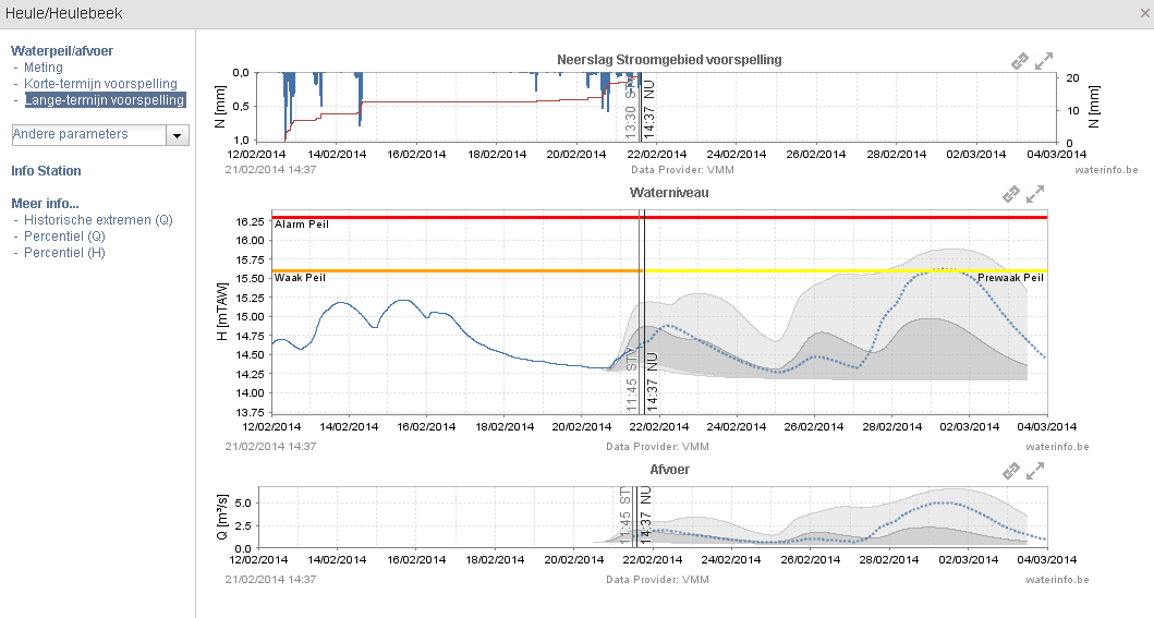
Long-term forecasts are calculated up to 10 days ahead for a selection of locations. These graphs, too, show a band of forecasts that indicate the probability of the forecast. Uncertainty bands are calculated on the basis of various possible rainfall forecasts that predict more or less rainfall. The wider the band, i.e. the further the forecasts are from each other, the greater the uncertainty.
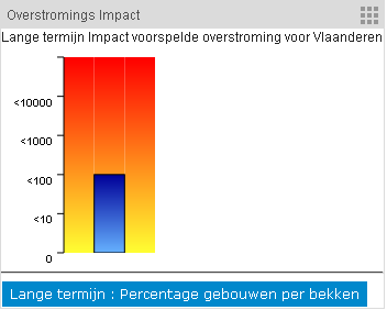 Professional users also have access to the flood impact module. This module shows the number of buildings for which flooding is forecast. It is also possible to view the percentage distribution of this total impact over the various river basins in Flanders.
The water levels at the coast and in the Scheldt tidal zone are continuously measured. Under current situation you will find the latest measurements. The tidal graphs module allows you to view measurements from different locations in the same area (e.g. Lower Sea Scheldt river or Durme) in the form of a single clear graph. The values can be read simply by moving the mouse over the graph. A graph can be displayed or hidden by clicking on the name of the measurement series at the bottom.
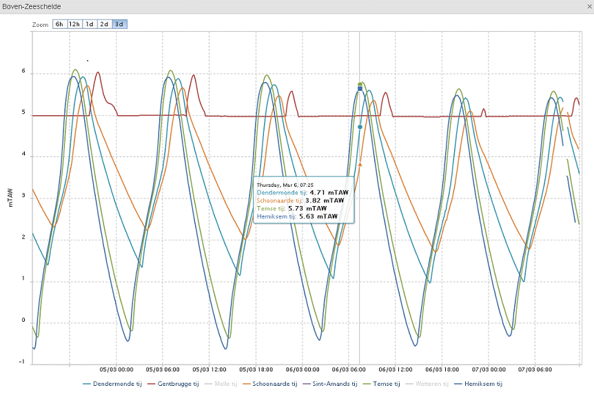
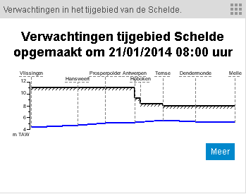
Under normal circumstances, predictions for the upcoming 48 hours for the Scheldt tidal zone are made twice a day. A tidal prediction is made for high and low water in Antwerp, Dendermonde and Melle. When making predictions, the forecaster interprets all forecasts from various sources (Flemish and Dutch models, astronomical forecasts…). The values in the tidal predictions are, therefore, always more reliable than the model output in the graphs on the map. Tidal predictions are in fact always computed and verified manually. The tidal predictions can be found under predicted situation – short term.
 The tide is determined primarily by the position of the earth, sun and moon, but higher or lower water levels can also be caused by the wind direction and wind speed. All these phenomena are taken into account to obtain an estimate, as accurate as possible, of the water level. Both high water and low water predictions are provided. High or low water always enters the Scheldt from the North Sea/Western Scheldt and then goes further inland.
When certain threshold levels in Antwerp are expected to be exceeded (e.g. at storm tide), the tidal predictions are refreshed up to five times a day. In addition, appropriate measures are taken by the water operator, such as the establishment of dyke monitoring, closing the gates in the Antwerp flood-retaining wall, preventive measures, etc. The colour codes of the forecast locations will then also change to yellow, orange or red (if the alarm threshold is exceeded).
Rainfall often plays the major role in the event of flooding. Clear rainfall maps allow you to track and quantify rainfall. Animated radar images let you track rain clouds in real time. Straightforward graphs and maps display rainfall forecasts for the upcoming hours and days.
You can call up rainfall measurements for a point and for a catchment area, referred to as point rainfall and catchment area rainfall.
- Point rainfall is recorded by a pluviometer. Several tens of these pluviometers distributed across Flanders transmit new data every 30 minutes.
- Catchment area rainfall is calculated on the basis of radar images from the RMI (Royal Meteorological Institute). Predicted radar images enable us to forecast catchment area rainfall for the upcoming hours. Weather models are used for the slightly more distant future.
The rainfall table module contains a summary of the recorded point rainfall over the past 24 and 48 hours for the various pluviometers. You can sort each column. You can also view this data in the form of a map or graph. Tables, graphs and maps are also created for the predicted situation. The predicted rainfall map module provides 4 tab sheets with the cumulative rainfall up to 36 hours ahead.
Persistent drought can create problems for farmers, adversely affect aquatic ecosystems, and even pose a threat to drinking water supply. In addition, low water levels and flows have an adverse effect on smooth shipping traffic. That is why, from April to September, we monitor the drought situation, gather accurate data and process this date into an easy-to-read form. This allows the severity, duration and geographical spread of a potential drought to be mapped. Various indicators are used for this:
- a map representation of discharge flows at locations where the measuring stations can also correctly measure low flows;
- a map representation of the rainfall deficit; and
- the “Standardised Precipitation Index” (SPI) indicators with accumulation periods of 1 month (SPI-1) and 3 months (SPI-3) indicate how dry or how wet the past month (SPI-1) and past three months (SPI-3) were as compared to the same period of the year over the past 30 years in Uccle. SPI-1, therefore, represents the short-term situation, whereas SPI-3 represents the longer term situation (a season).
The rainfall deficit table module contains the rainfall deficit for the various weather stations in Flanders. It is an indicator of the amount of rainfall that is lacking for optimal crop growth. The rainfall deficit is obtained by calculating the difference between the calculated reference crop evaporation (potential evapotranspiration) and the amount of rainfall. This difference is totalled daily between 1 April 1 and 30 September. If the potential evaporation exceeds the rainfall, the rainfall deficit increases.
In addition, more specific indicators are used for (deviations of) the total rainfall, the flows and the basic flows. These are reported from April to September in monthly low water reports and, in the event of a drought, drought reports. These reports can be consulted under the tab "Reports".
View
This page allows you to consult map reports of the past period. The reports contain, among other things, interpolated rainfall (deficit) maps, but also point measurements of temperature, evaporation, wind direction, etc. You can also view layers with recent measurements of physical parameters, such as sediment concentration and dissolved oxygen. You can tick these layers via the modules in the right column.
The daily map reports are created automatically. The map reports showing the situation for the past months, or years, are published after being manually checked by the administrators of waterinfo.be.
In the map reports module you can select what you want to view on the map. After you have selected the type of report you want, select the desired period. The explanation of the symbols used in the reports will also appear in the legend.
Download
This page allows you to download measurements. Select the desired parameter (e.g. water level, rainfall, acidity, etc.) and resolution (e.g. hourly, daily, annually, etc.) in the left column (1A-1D). Table (2) in the middle of the page will then show the series that are available for your chosen profile and the area displayed on the map (3). By editing the region on the map, you can change the list of stations in the table. Clicking on the column titles allows you to sort the table. Tick the desired series and click on "Show and download". You can view the series and download the required period. When downloading the data, you also receive a file with a disclaimer and the explanation of the quality codes used.
The download by map layer module allows professional users to download or view a complete parameter layer via a web link.
The geo portal lets you consult all waterinfo maps. The map layers are divided into different groups:
- maps from the Flemish Hydrographical Atlas (VHA)
- water assessment maps;
- hazard and risk maps under the Floods Directive (FLD);
- other maps.
The layers are ordered alphabetically, but can also be filtered by name or source. You can add a layer to the map by ticking "active" in the left column. The name of that layer will then also appear in the map layers module, where you can tick or untick the layer and adjust the visibility. The legend contains the symbols used for each layer.
The map tools module allows you to measure distances on the map, search for addresses and locations, or add an address to your favourites.
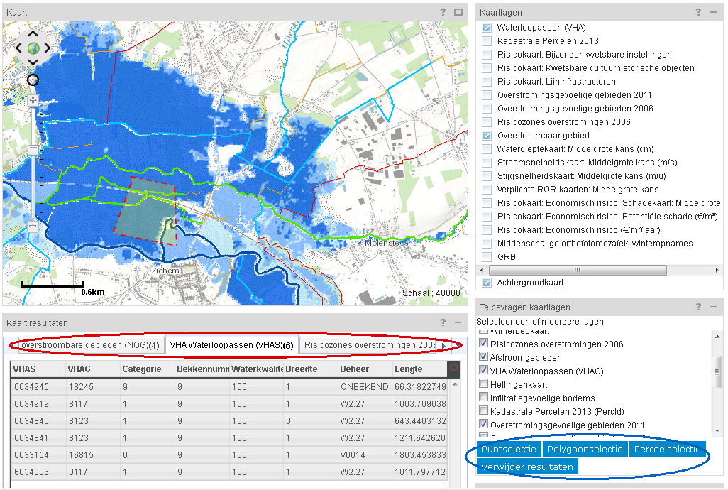
In the map layer query module, you can tick the information that you wish to bring up for a specific location. You can then select this location on the map. You can select a point, a polygon drawn by you or a plot. You can view the results of your query in the map query results module. For each requested layer, a new tab page with a table is displayed here. If you click on a row of the table, the map will zoom to this location.
A summary of the various
map layers with explanation, can be found here:
Maps from the Flemish Hydrographical Atlas (VHA)
| Map layer |
Explanation |
| Polders and waterboards |
This map shows the boundaries of the public bodies of water with the responsibility of realizing the objectives of integrated water management within their territory. |
| River basins |
The boundaries of the 11 Flemish river basins can be found on this map. |
| VHA zones |
A VHA zone is a sub-hydrographical unit that represents the capture zone of a watercourse or a section of a watercourse. The positioning of the boundaries of the VHA ones is based, among other things, on drainage via surface water, relief and comparable surfaces of these zones, and is included in the Flemish Hydrographical Atlas. |
| Watercourse axes (VHA) |
This map is an element of the Flemish Hydrographical Atlas and contains the axes of navigable watercourses (waterways), non-navigable classified waterways and a number of non-classified waterways. |
Water assessment maps
| Map layer |
Explanation |
| Run-off areas |
This map shows to where rainwater will run-off above ground, based on the digital elevation model. |
| Erosion-sensitive areas |
This map shows the areas that are sensitive to erosion. |
| Areas prone to groundwater flow |
This map provides a first indication of the sensitivity to disruption of shallow groundwater flow. |
| Slope map |
This map divides Flanders into four different categories of slopes. |
| Infiltration-sensitive soils |
This map shows the soils where infiltration will be relatively easy; this does not mean, however, that infiltration is excluded in soils that are not shown on this map. |
| Areas prone to flooding |
Here a distinction is made between areas actually and potentially prone to flooding. Areas actually prone to flooding are areas that were recently flooded or areas where there is a significant probability of flooding based on models. Areas potentially prone to flooding are areas where flooding is possible only under extreme weather conditions or when flood defences fail, e.g. dyke breaches. These are, in principle, historical valleys and marshlands. |
| Recently flooded areas (RFA) |
This map includes an inventory of all recorded and documented floods since 1988. The map is based on reports from local authorities, emergency services, helicopter flights, etc. |
| Flood-risk areas |
This map was laid down by the Royal Decree of 28 February 2007 and shows the locations where the possibility of damage is greatest. A fire insurance policy, which also covers natural disasters, such as flooding, is based in part on this map, both for calculation of the premium and as grounds for the possible refusal to insure new buildings. |
| Naturally floodable areas (NFA) |
This map is based on the soil map and indicates all areas where sedimentation by the water system has occurred. These may relate to sloping areas (colluvia), flooding from the waterway (alluvia) or historical flooding by the sea. In principle, this refers to historical valleys and marshlands. |
| Winter bed map |
This map shows the main flooding areas along navigable waterways. |
Hazard and risk maps under the Floods Directive
| Map layer |
Explanation |
| Particularly vulnerable facilities |
This map shows facilities that are either difficult to evacuate (hospitals, healthcare institutions, prisons, schools, etc.) or of importance in crisis situations (police stations, fire stations, etc.) and that are located within the floodable area associated with a low probability of flooding. |
| Economic risk |
This map shows the weighted combination of all available damage maps, expressed as "the annual average damages" or €/m²/year. |
| Economic damages |
This map shows, for a particular scenario (low, medium, high probability), the economic damages, calculated as a function of water depth, time of occurrence (e.g. for agriculture), flow velocity and rate of rise of the water level, expressed in €/m². |
| Hydrographic network |
This map represents the watercourses associated with a significant potential flood risk in accordance with the Floods Directive. |
| Vulnerable cultural-historical objects |
This map shows the cultural-historical buildings (castles, mills, churches, monasteries, etc. either listed as historic monuments of not) and landscapes (anchor points, areas containing relics, etc.…) that are located within the floodable area associated with a low probability of flooding. |
| Line infrastructures |
This map shows various physical (e.g. roads and railways) and non-physical line infrastructures (e.g. bus routes) that play an important role in the movement of people and goods to, in and through the floodable area. The map shows road sections, bus routes and railway lines running through the floodable area associated with a low probability of flooding. |
| Flood hazard maps |
Flood hazard maps show the physical properties of flooding associated with the flooding scenarios (extent of flooding, water depth, flow velocity, etc.). |
| Floodable area |
This map shows the areas exposed to the risk of flooding. Such flooding may arise from both waterways and the sea. The map shows the extent of flooding for the three different flooding scenarios (low probability, medium probability, high probability). |
| Potential damages |
This map shows the potential (maximum) damages in the event of flooding and is expressed in €/m². This value is obtained by applying the damage calculation to a fictitious water depth map (all of Flanders under 10m of water) and gives an upper limit for the economic damages. |
| Overall flood risk maps |
This risk map shows the potential adverse consequences expressed in terms of inhabitants potentially affected, the type of economic activtity, the IPPC installations and the potentially affected protected areas associated with each flood scenario. |
| Rate of rise in water level |
This map shows, for a particular flood scenario, the maximum rate of the rise in the water level, as calculated using the hydrodynamic models. This map has only been created for the coast where this parameter is relevant. |
| Flow velocity |
This map shows, for a particular flood scenario, the maximum flow velocity in the floodable area, as calculated using the hydrodynamic models. Flow velocities are given only for complete 2-dimensional models that allow for an accurate estimate of the flow velocity (Coast). |
| Water depth map |
This map shows, for the floodable area, the maximum water depth associated with each scenario (low probability, medium probability, high probability), expressed in centimetres. The water depth is calculated as the distance between the water surface and the ground level, based on the hydrodynamic models and the digital terrain model (DTM) for Flanders. |
Other
| Map layer |
Explanation |
| Municipal districts |
This map shows the boundaries of the municipal districts in Flanders. |
| Large-scale reference database (LRD) |
The large-scale reference database is a database containing large-scale data, such as buildings, plots of land, roads and their layout, waterways, railways and civil engineering structures. These objects are detailed and accurately measured (source: AGIV). |
| Land registry parcels |
This map shows the areas of land, their boundaries and the buildings on them. |
| Medium-scale orthophoto mosaics, winter recordings |
This map is built up from aerial photographs with a resolution of 25m (source: AGIV). |
| AGIV orthoimagery |
Digital photographic aerial views that provide a clear picture of the soil cover. |
| Integrated Water Policy – Pre-emption Right – perimeter areas |
The Integrated Water Policy Decree stipulates that the Flemish Region has a right of pre-emption when property or land, located in the riparian zones delineated in the basin management plans and in the flooding areas delineated in the basin management plans or catchment area management plans, is sold. This dataset delineates these areas. The digital database is not a legal document. |
| Signal areas |
Signal areas are areas that have not yet been developed but are already firmly designated under the zoning plan (residential area, industrial area, etc.) and which may also be instrumental in the approach to flooding because they are floodable or because they have specific soil properties enabling to them act as a natural sponge. |
The geo portal also has a number of modules that can be accessed only by professional users. They can add these modules from this page to their dashboards.
- Upload map layers: Allows you to display your own shape files on the map.
- Query map for social media: This module lets you display results from Flickr, Twitter and YouTube with a geo-tag on the map. If you fill in a search term and time window, the icons of the social media channel will appear on the map. You can then click on them to view them.
- Refresh page: Professional users can select here the automatic refresh rate for the web page.
The flood survey portal allows professional GIS editors to map floods. Following a period of flooding, it allows the user to inventory the water heights, flooding contours and details about flooded buildings. The following map layers are provided for this purpose:
-
Thresholds: This layer uses triangles to show the location of measured thresholds, i.e. the lowest point of a building through which the water can enter. This layer allows you to indicate how far above or below the threshold the water was.
- Buildings: This layer is displayed if you zoom far enough into the map. Here you can edit the status of a building (flooded or not).
- Contours: The flooding contours show the extent of the flooding in a given area.
To edit map layers, click on Start Editing under the pencil in the Map Tools module. You can create new objects by clicking on the required layer and then start to draw on the map. You can also edit existing objects. To do so, zoom into the threshold/contour/building that you wish to edit, select it and edit the attributes or shape. The changes are immediately saved in the database. When you have finished, you click on Stop Editing.
This page lists reports and publications from the waterinfo partners. Each month, we publish the latest hydrological situation reports. Under Annual Reports, you can find yearbooks of the Hydrological Information Centre (HIC) and 10-year summaries with validated measurements of the HIC. After major flooding or periods of drought, flood reports and drought reports are made available. Under Tide tables, you can find the astronomically predicted low and high water details for Antwerp, Prosper Polder, and Wintam.
 If you wish to use waterinfo.be on a regular basis, you can request an account and personalise the website. A distinction is made between the following types of registered user:
- Public user;
- Professional user;
- Professional GIS editor;
- Staff member of waterinfo partner.
After you create an account, you will receive a confirmation e-mail in your mailbox. Once you have logged in, the website will remember your settings. In this way, you can indicate your favourite graphs and save your location on the map. These functions are accessible to public users.
 Professional users, such as emergency services and municipal officials, may request additional rights via edit account. A form will be displayed, in which you can enter your professional details and indicate the professional applications that you wish to use.
Professional users are routed to a dedicated website: pro.waterinfo.be. This site cannot become congested or subject to delays as a result of a large numbers of visitors. In this way, the availability of measurements and forecasts is guaranteed also during peak moments. You can log in directly via pro.waterinfo.be. If you log on via www.waterinfo.be, you will be automatically diverted to the professional site. In addition, the telephone icon provides access to the contact details of the operators, who can be reached 24 hours a day, 7 days a week.
 As a professional user, you have access to five dashboards or pages where you can group the modules of greatest interest to you. The graphs and "zoomed-in" maps for your area are thus displayed on a single screen for fast and easy access. You can add modules directly to one of your dashboards via the icon at the top right of the module. If you are logged in, detailed information about the dashboard configuration can be found under the menu "About waterinfo.be/Dashboards".
If you are a GIS editor, you can map the areas that were or were not flooded on the flood survey portal. More information can be found under the flood survey portal.
If you have any questions about the content of the website, please click on the envelope icon at the top to send an e-mail to the operators of the Hydrological Information Centre (for navigable waterways) or the Flemish Environment Agency (for non-navigable waterways).